Brand: Hansaplast x Zepto
Scope: Typography, Strategy
Year: 2025
Location: Ahmedabad, GJ & Kolkata, WB
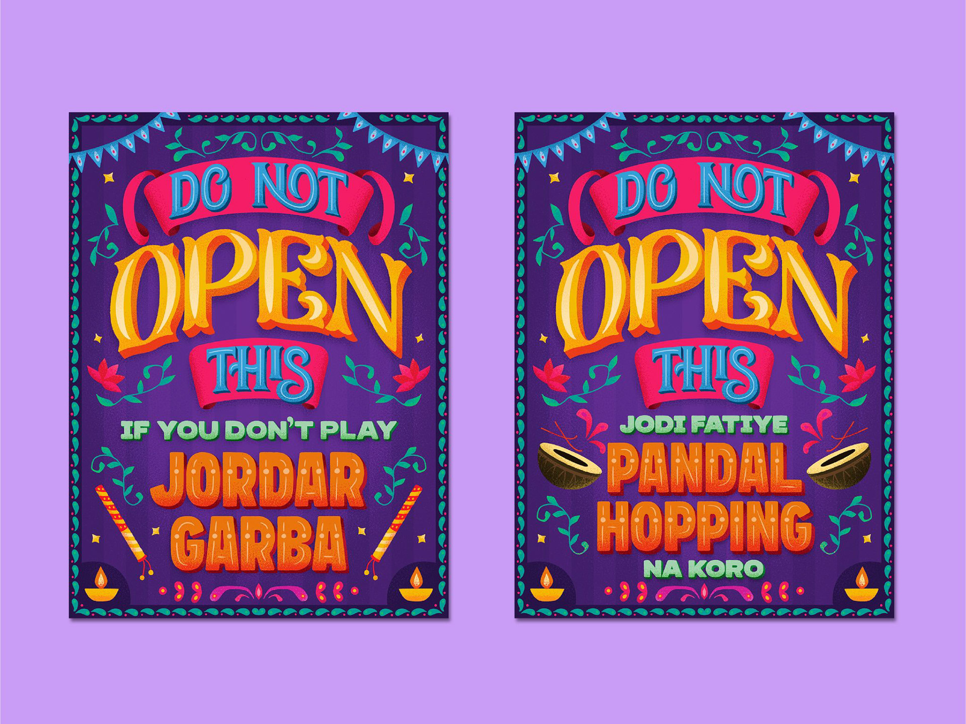
Hand drawn illustrations for Ahmedabad (left) and Kolkata (right)
We initially decided to have the visuals of a woman getting a shoe bite and a man helping her put a bandaid on. The envelope size was too small to have an illustration where the entire human body needed to be shown, the scale would reduce too much.
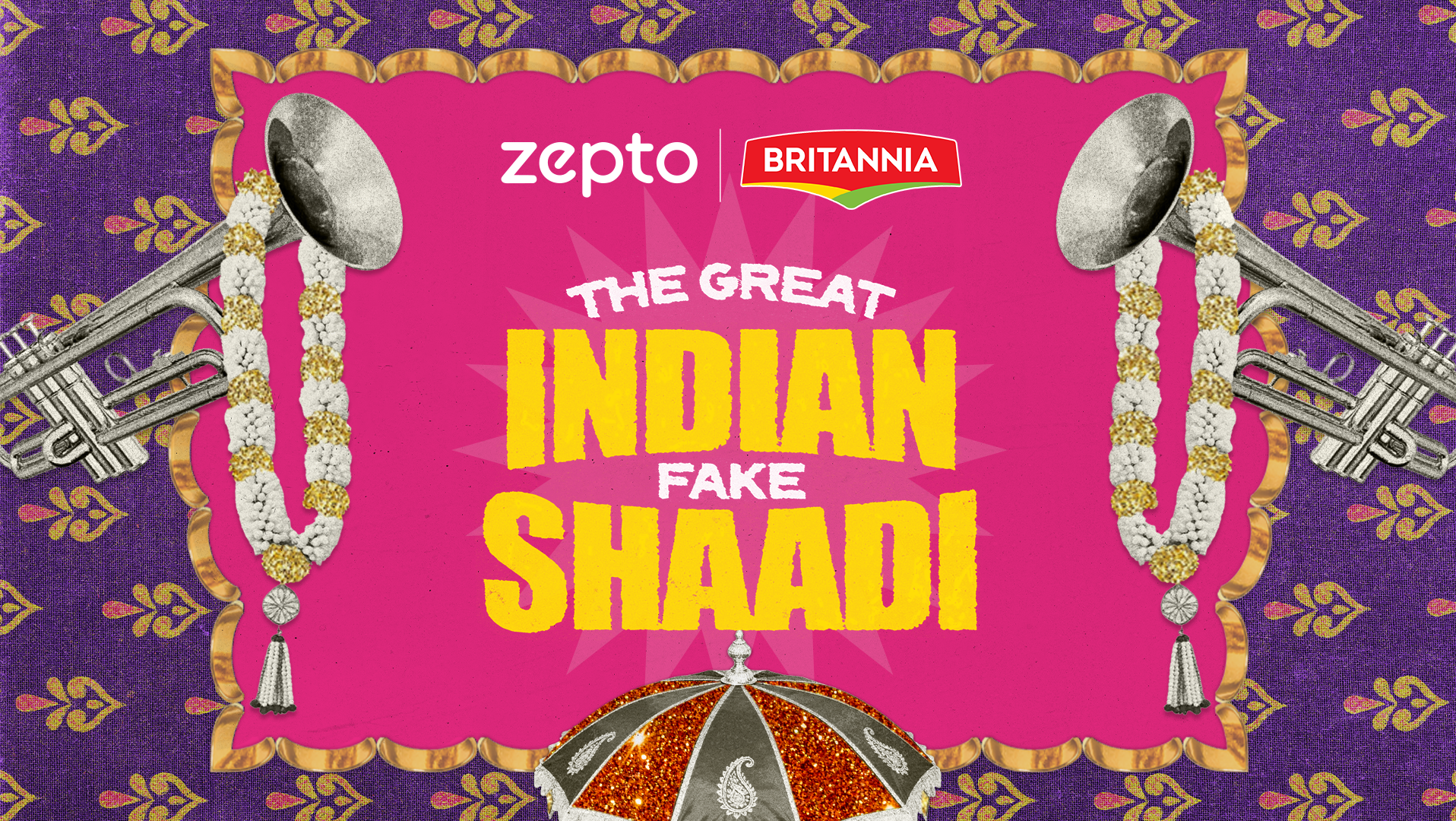
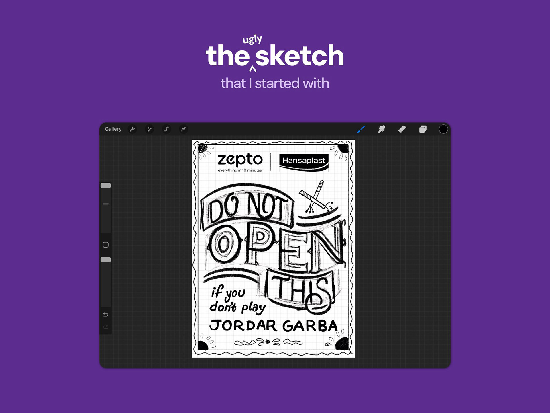
Eventually, I came up with the concept of a type-led design where the letterforms do the talking. The copy would occupy the entire available space and the message would be loud and clear.
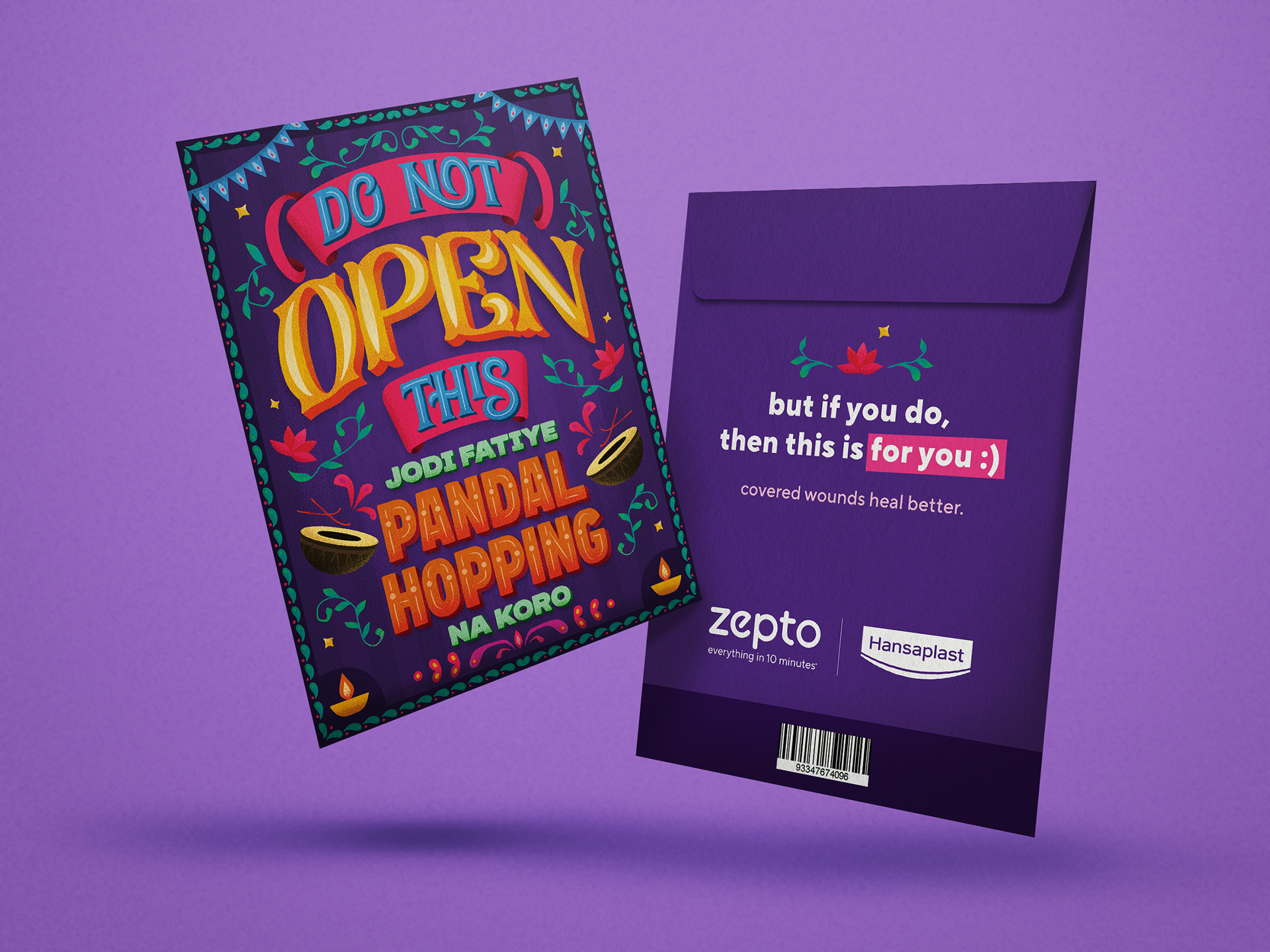
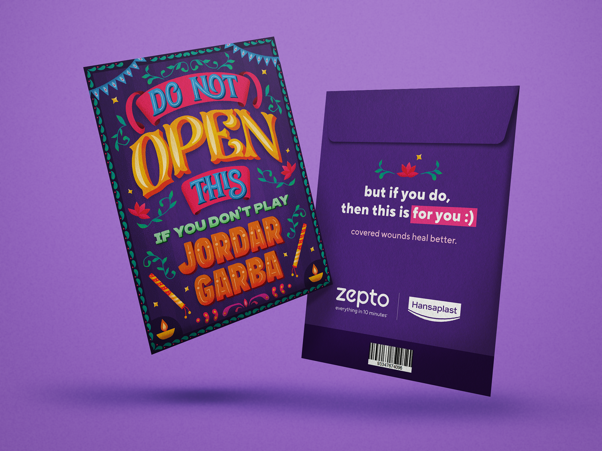
Two separate versions were designed for both Kolkata and Ahmedabad, applying hyper-local cultural references in the copy. The letterforms are loud, expressive, with Indian motifs and festive elements spread throughout in joyful Indian maximalism, to reflect the chaotic festive season of Navratri and Durga Puja.
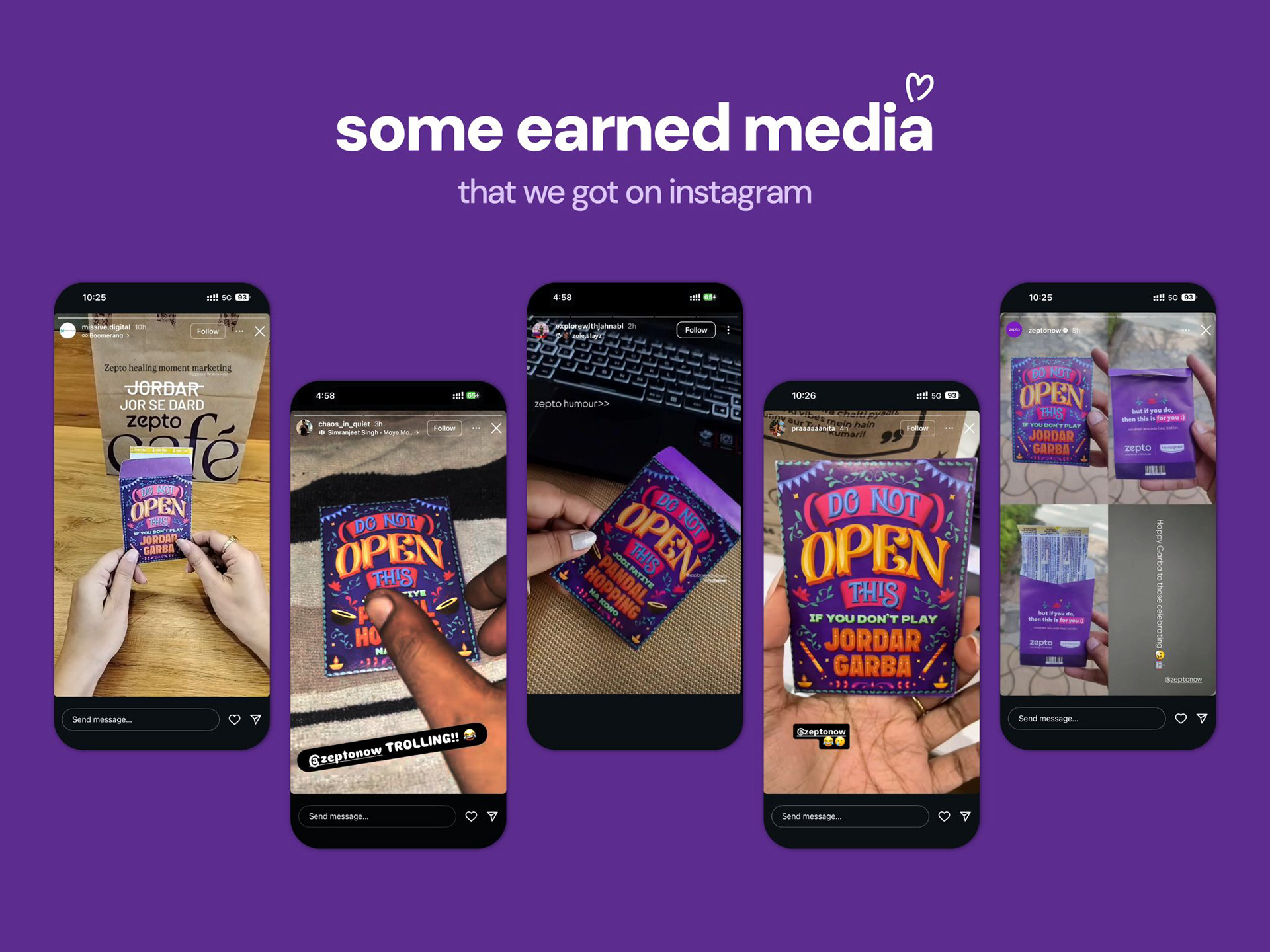
The activation wasn't promoted or advertised anywhere. The customers did not expect a 7-billion-dollar brand to care about them at such a micro level, which is why all the earned media received across social media had an element of surprise on the customers' end. Some felt cared for, some were shocked, some even felt that we were trolling.
This activation was a part of Zepto's history of taking the most mundane insights about customer behaviour and turning them into actionable playbooks using the power of culturally-relevant design and copy.