Brand: Zepto
Scope: Typography
Year: 2025
Location: Bengaluru, KA
The Kannada wordmark for Zepto was born purely out of a legal necessity (The State of Karnataka requires all businesses to display their names in both English and the local language) and everyone was ready to use a stock typeface and be done with it. As a self-proclaimed type connoisseur, I offered to design a custom type for it and I'm so glad I did.
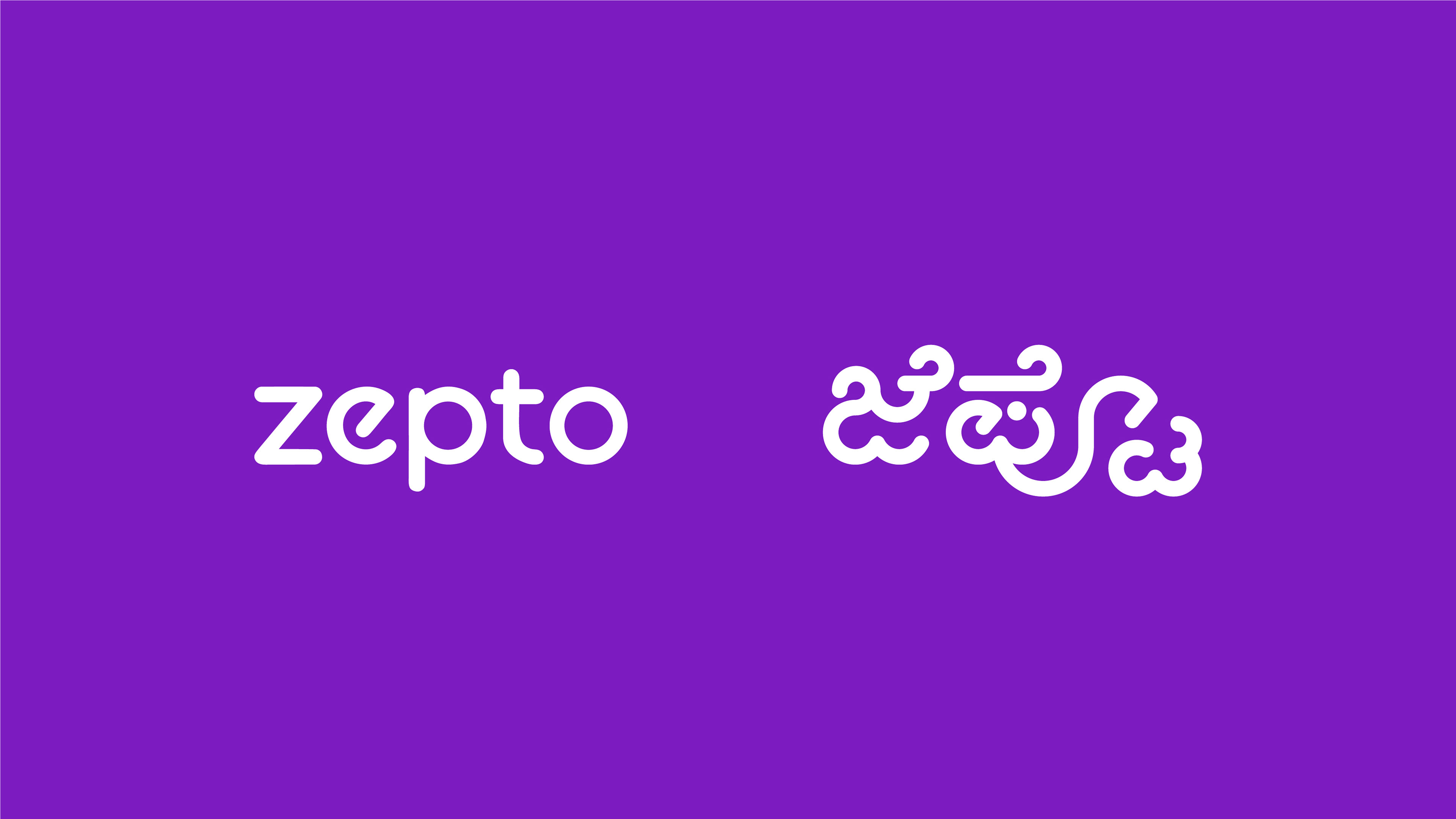
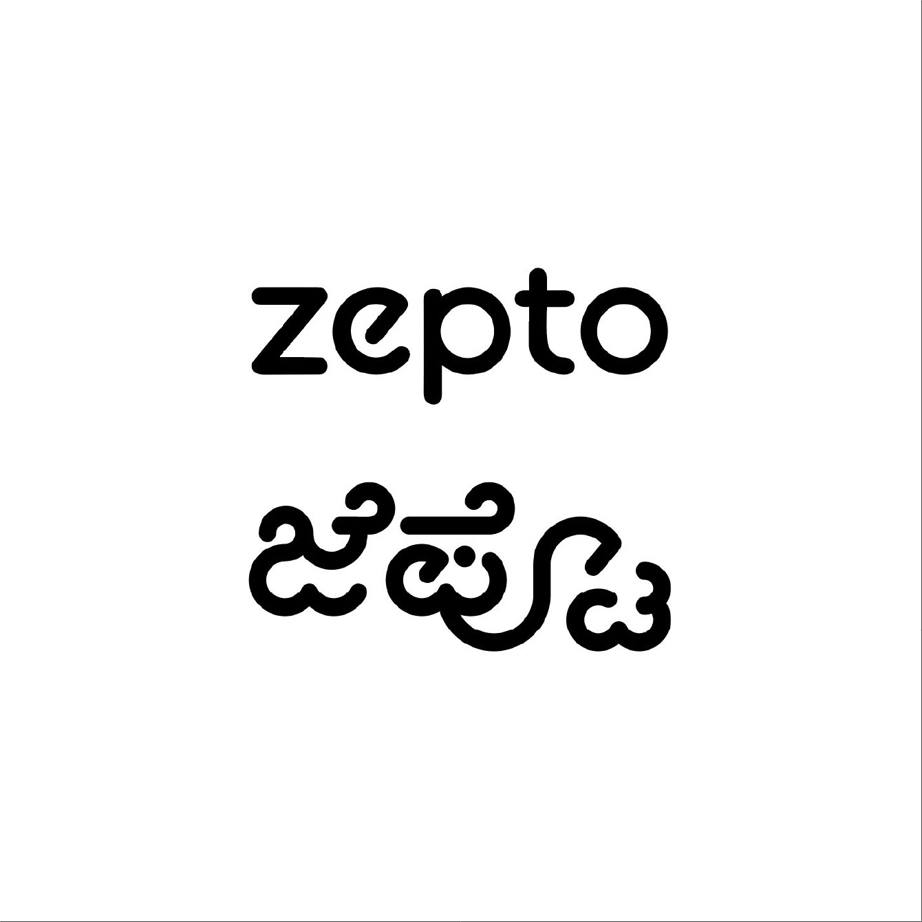
English and Kannada wordmarks placed side by side
I started learning type design during Covid. I remember struggling endlessly to draw the letter ‘S’ (still do!). But somewhere along the way, I fell in love with it. And now, designing custom type has become a core part of how I approach branding.
That’s why this project meant so much to me.
That’s why this project meant so much to me.
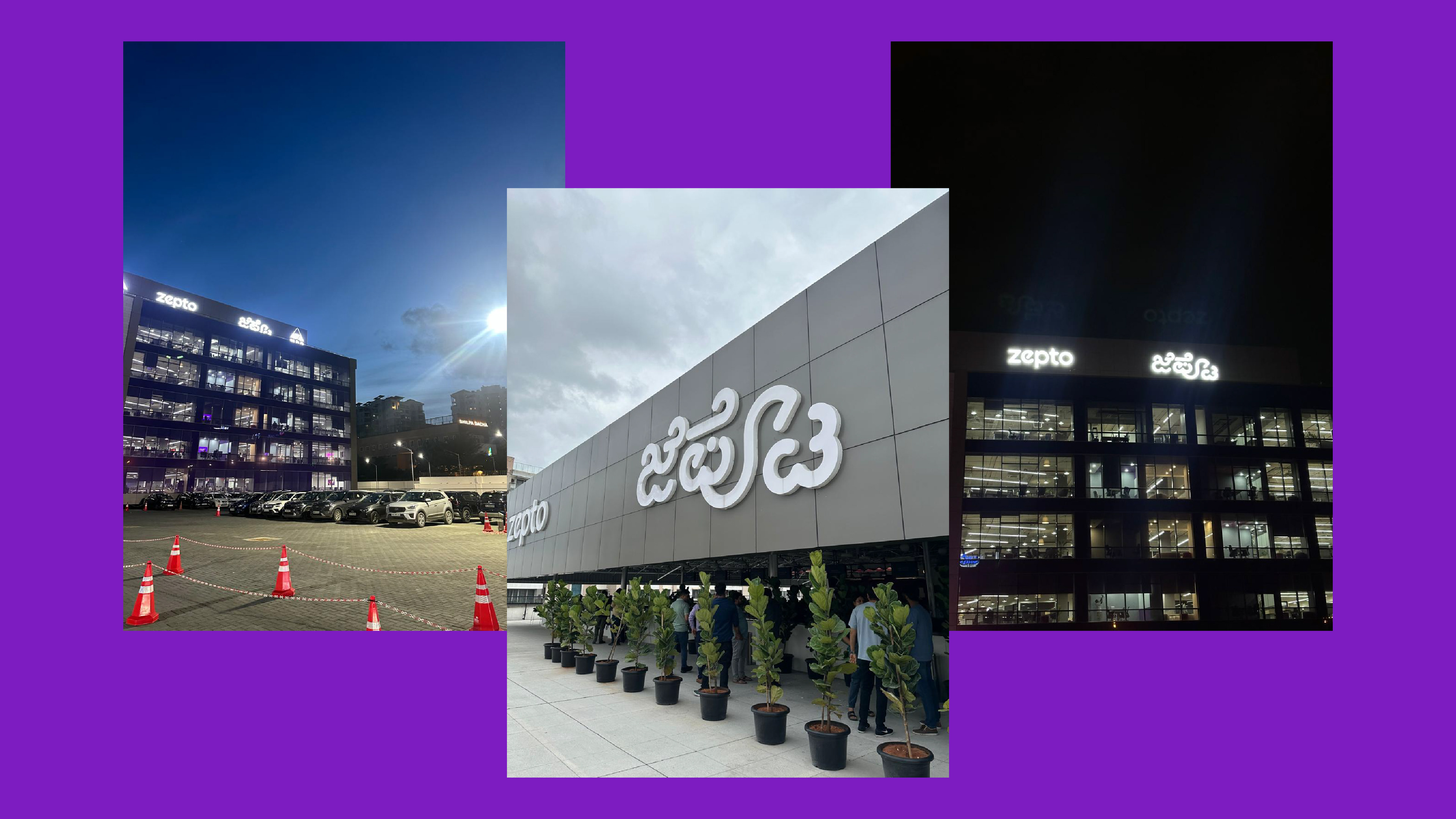
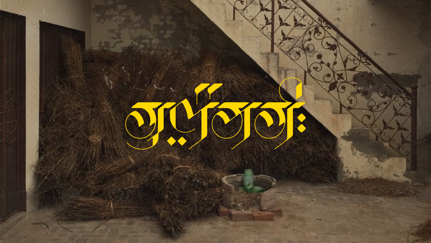
The fabricated wordmark on the Zepto HQ, Bengaluru, India
Too often, I see buildings where the English name is set in a beautiful, stylized typeface, and the Kannada version looks like a last-minute afterthought. It breaks my heart. Type design isn’t just aesthetic — it’s about respect, storytelling, and identity.
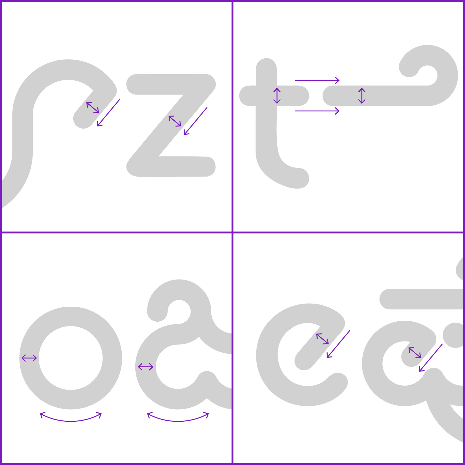
English and Kannada letterforms compared
I tried to incorporate the nuances and characteristics of the English wordmark into the Kannada letters. Since I can’t read or write Kannada myself, this involved a lot of research, conversations, and support from some incredibly kind and generous people.
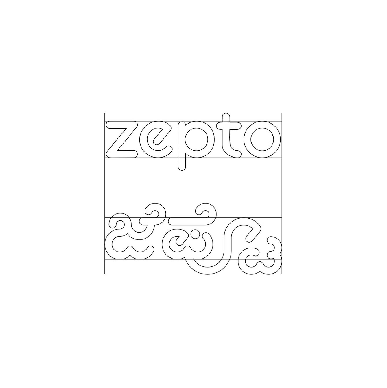
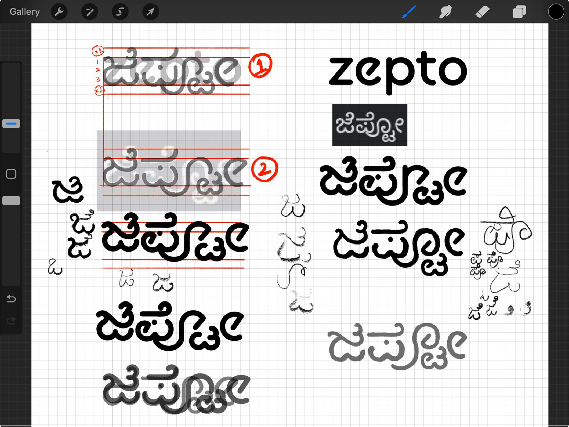
Wireframe
Final vector form
Bengaluru's rule that all businesses must display their name in Kannada, I think, is kind of amazing. Indian languages are so visually rich, yet they’re often criminally underused in design.
This law, in a small way, pushes businesses to engage with their local script- and sometimes, to create something truly beautiful.
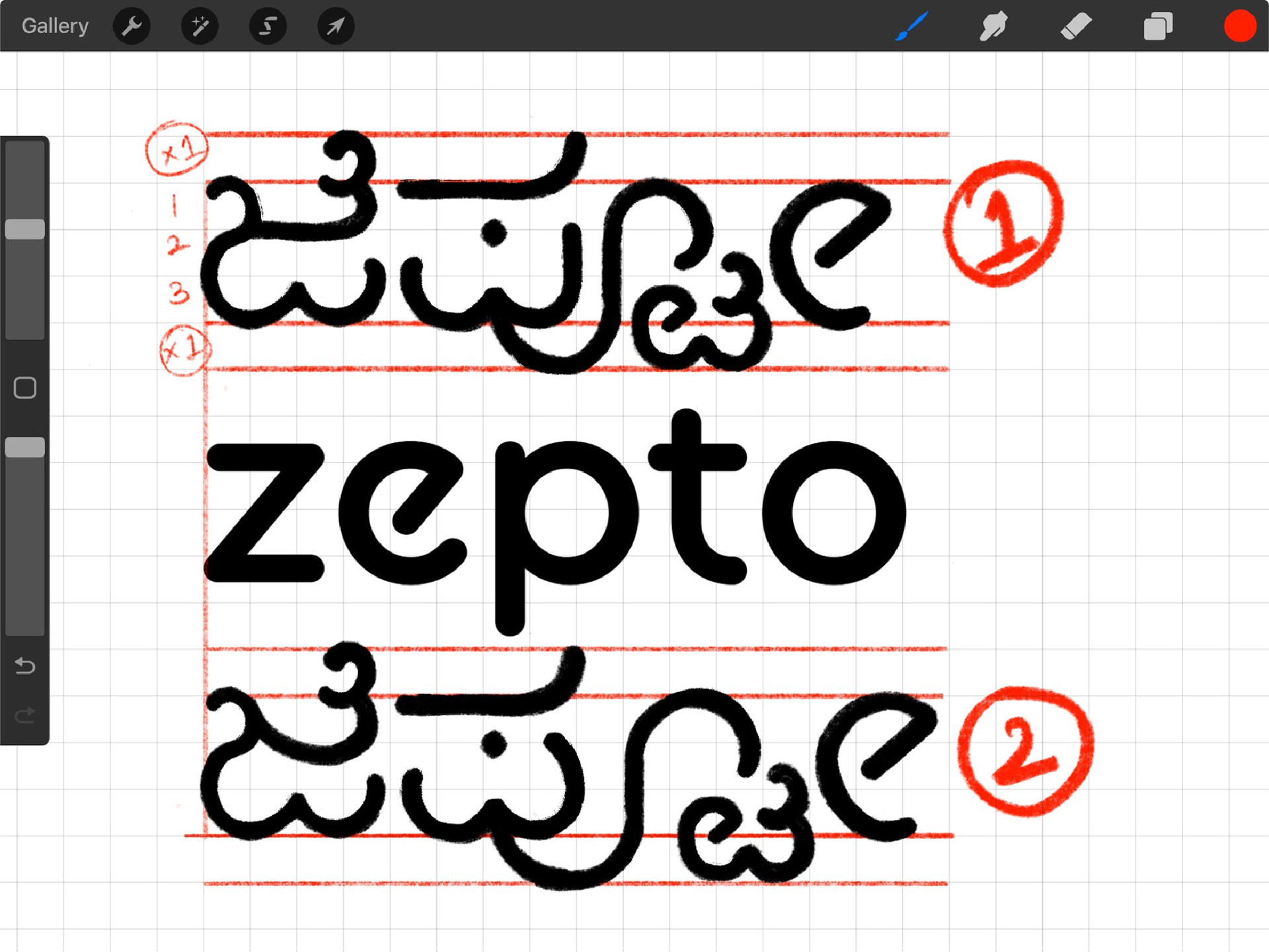
The initial sketch that I started with
Refinements based on feedback and grammatical corrections
It took time and sometimes I feel nobody would even notice it. But every time I see that logomark glowing outside the building, I’m reminded that it was all worth it.
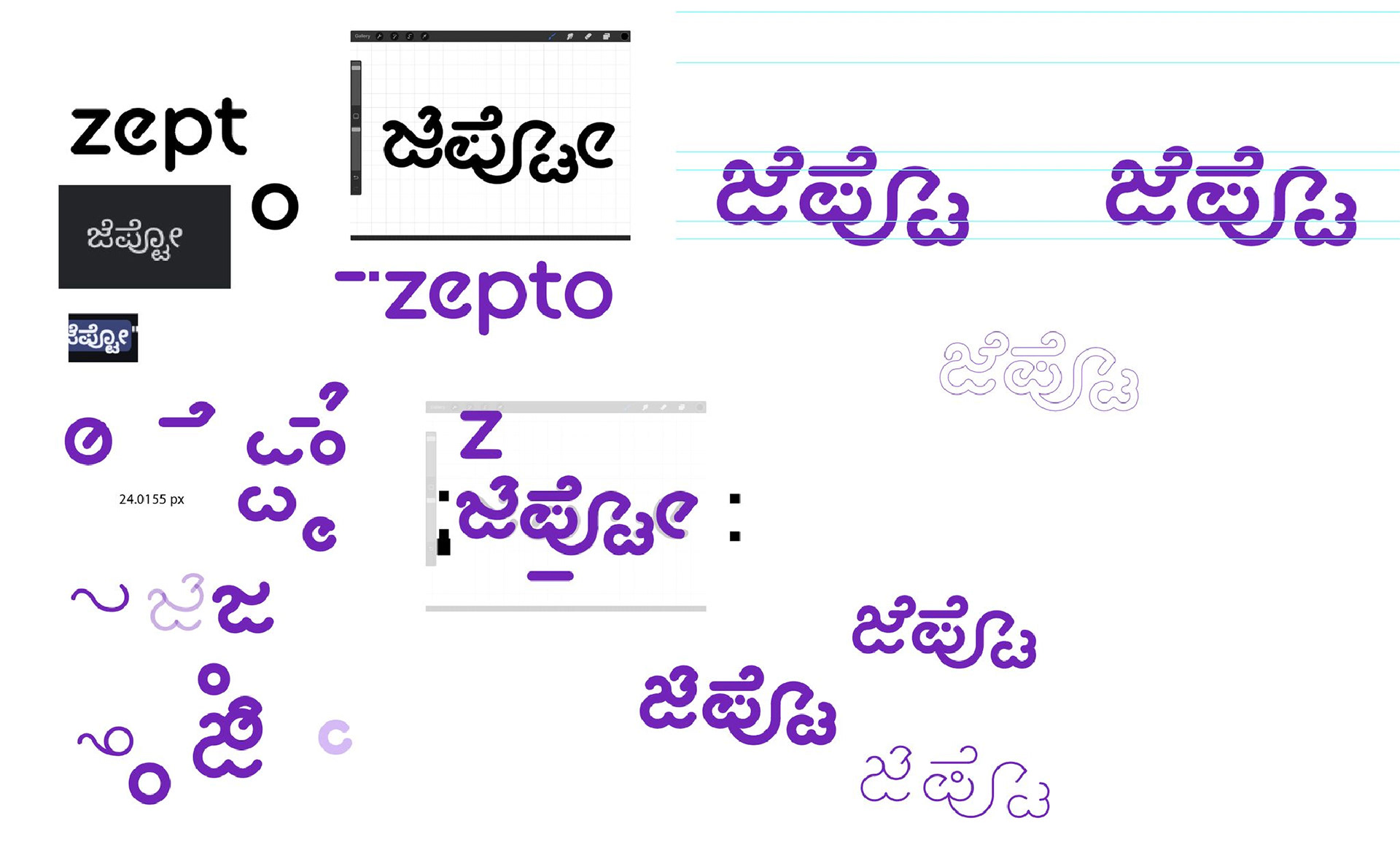
The vectorisation process
And hopefully, just maybe, it encourages more designers to explore the beauty of our Indian scripts. Because type design isn’t just aesthetic- it’s about respect, storytelling, and identity.